Created for VeiligheidNL (Opens in a new tab)
As part of ROX | digital agency (Opens in a new tab)
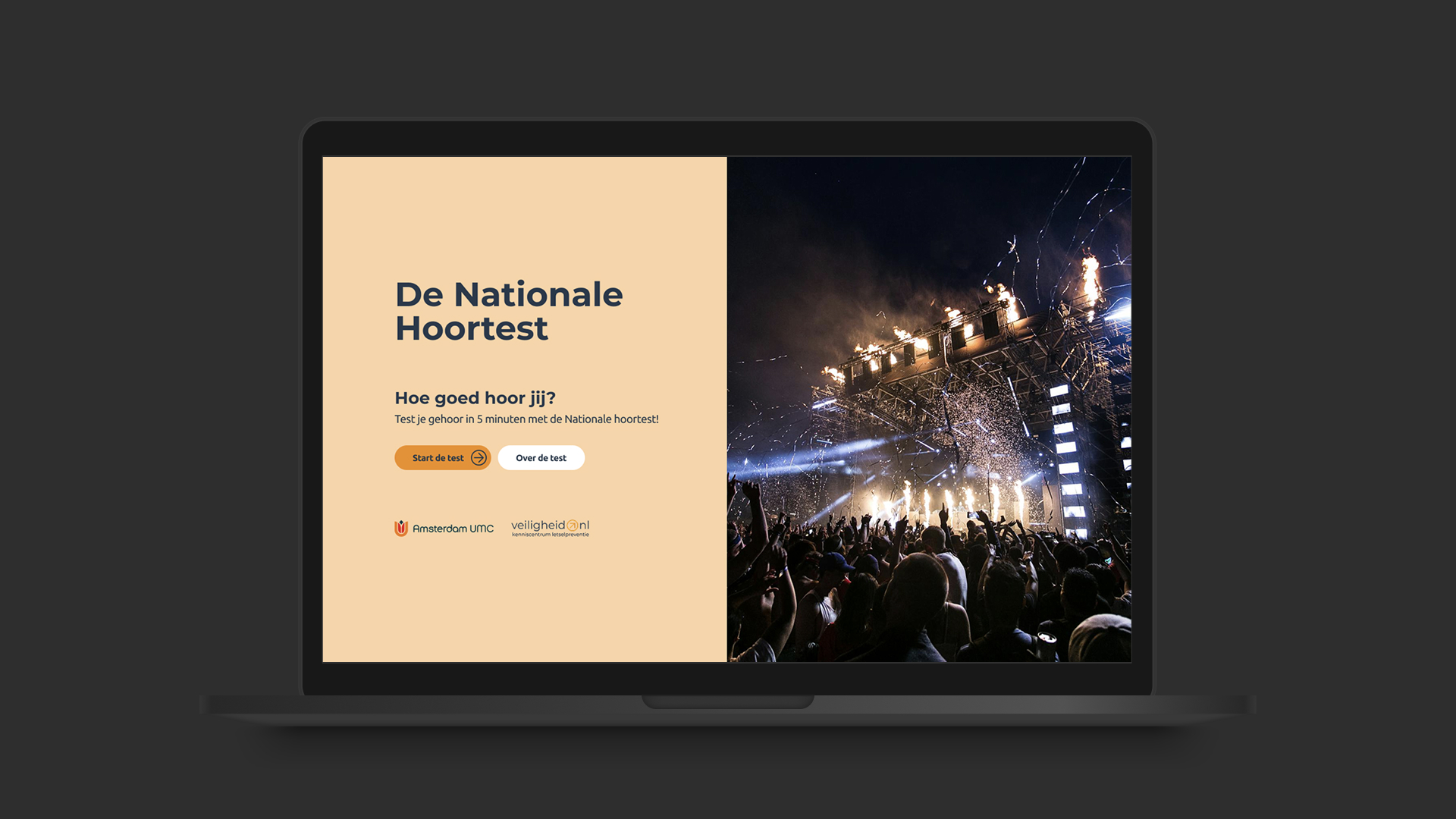
When a phone-era test meets modern expectations.
VeiligheidNL helps the Netherlands stay safe, from workplace hazards to everyday risks. Their hearing tests exist to catch hearing damage early and guide people toward professional help.
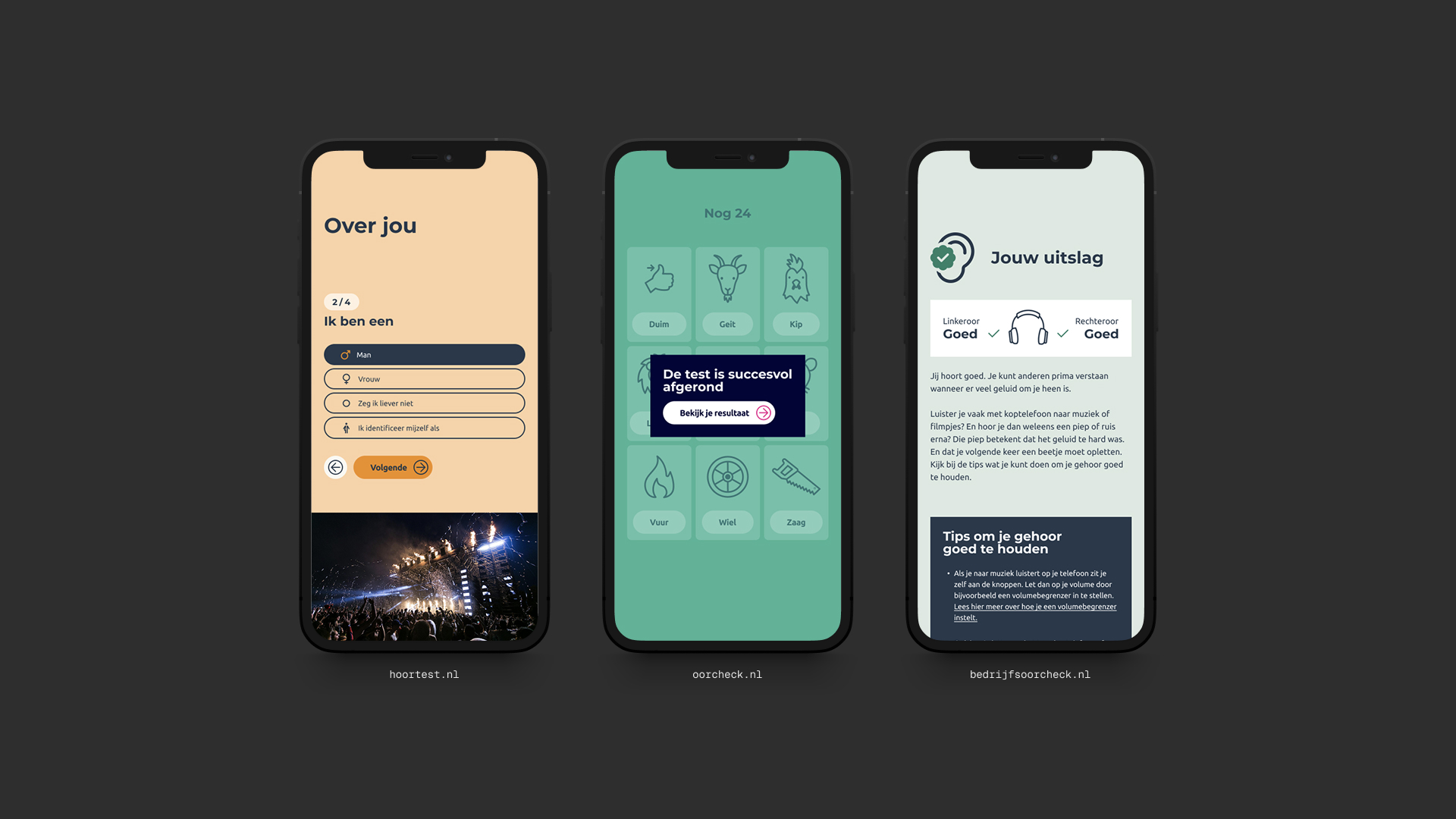
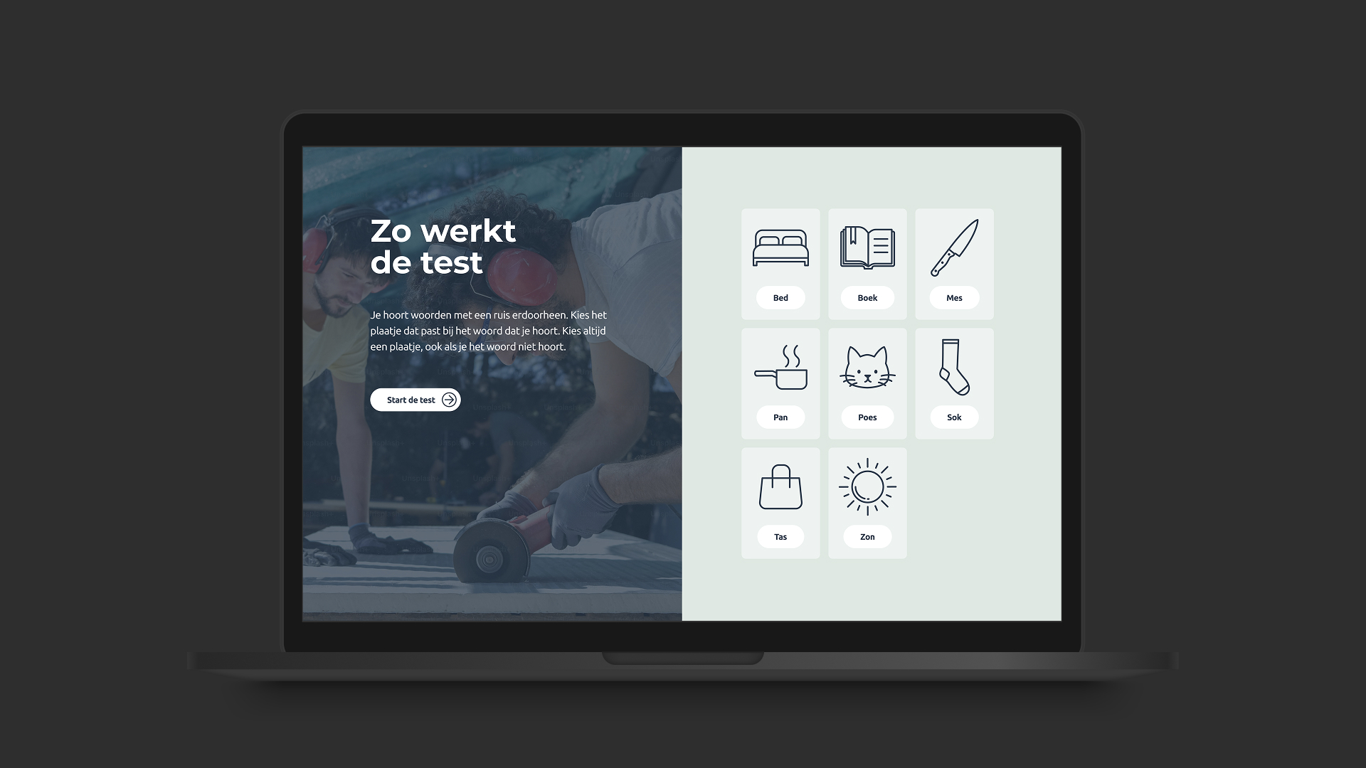
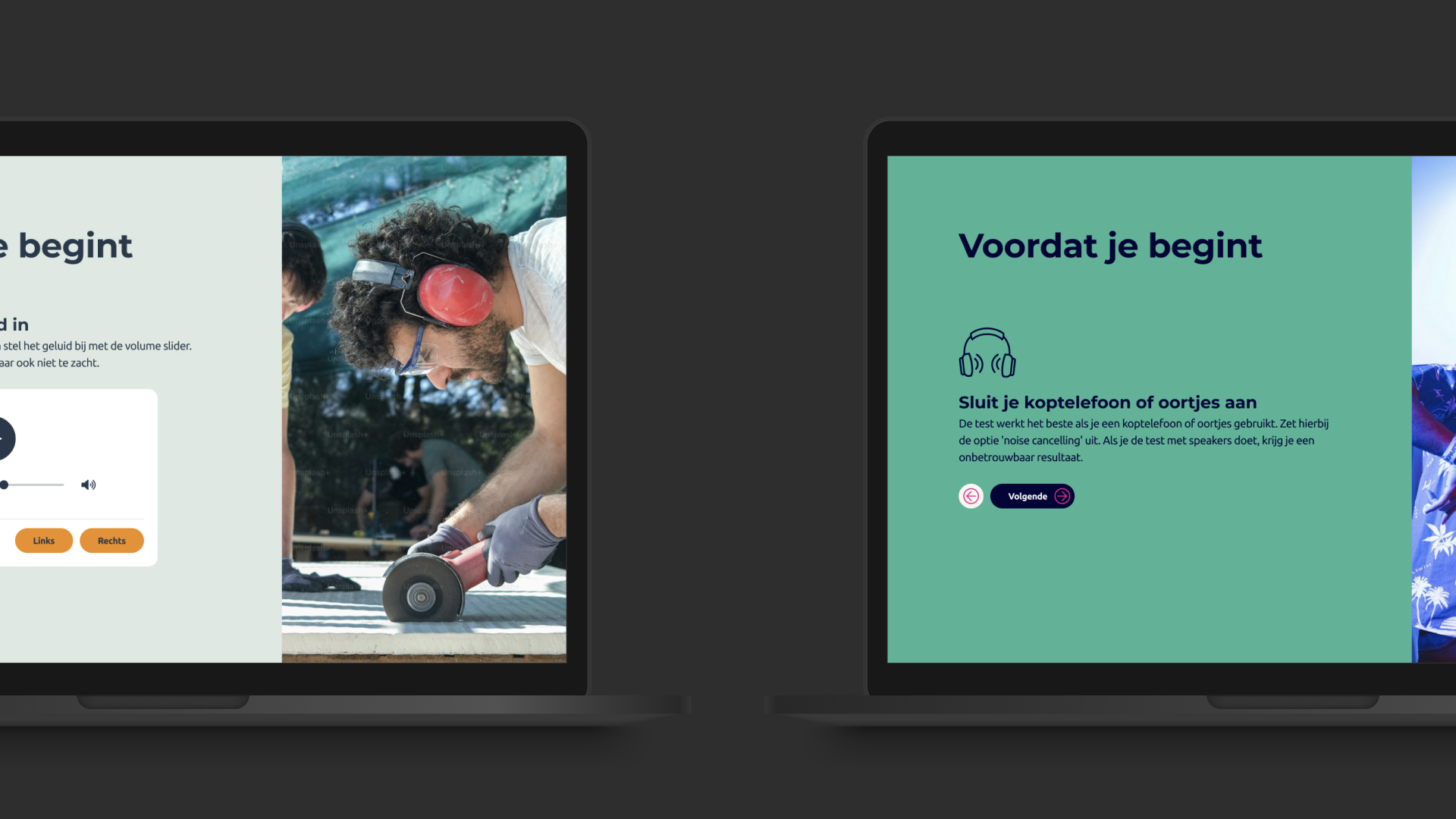
But the tests were showing their age. Originally designed for phone use, they had migrated to the web without ever truly adapting to it. A long form before the test, instructions often skipped and a rebranding in progress.
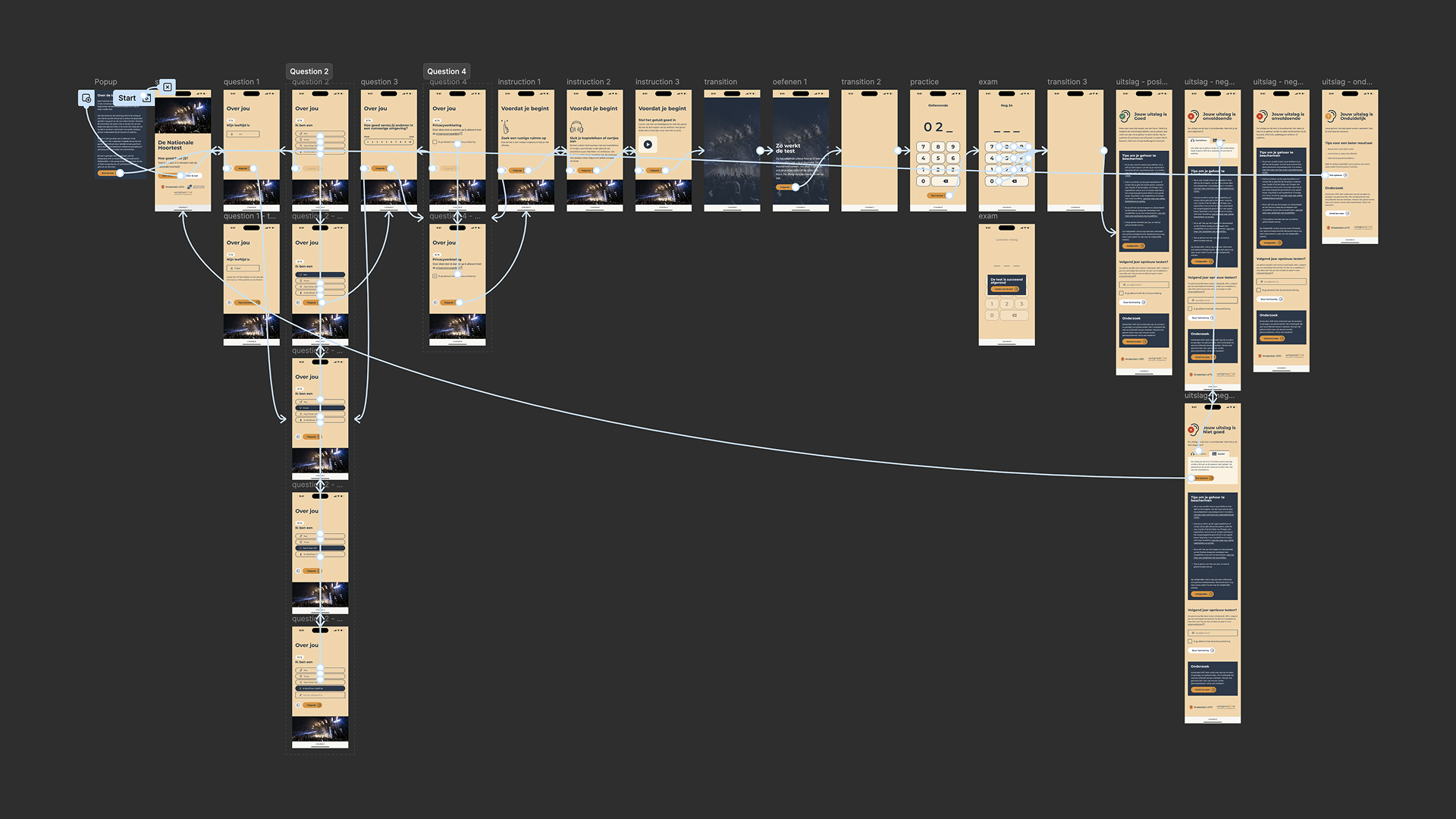
We redesigned three hearing tests into one unified system: reducing friction, commanding attention, and building on a brand guide that wasn't finished yet. A cleaner, clearer path from first click to knowing whether you need help.
Client VeiligheidNL
VeiligheidNL is een non-profitorganisatie die zich inzet voor het verminderen van ongevallen en het bevorderen van veiligheid in heel Nederland. Al meer dan 35 jaar ontwikkelt VeiligheidNL tools, campagnes en hulpmiddelen voor uiteenlopende onderwerpen, van kinderveiligheid tot gehoorschadepreventie. Ze vertalen onderzoek naar praktische oplossingen die mensen in het dagelijks leven beschermen.
All about VeiligheidNLAgency ROX | digital agency
ROX is a digital agency located in Rotterdam that specializes in helping companies with their digital growth. Through a combination of strategic advice, polished designs and custom software development, they create web applications that are future-proof, scalable and improve work efficiency.
All about ROX | digital agencyRole UI/UX Design, Research
I joined from the first meeting through to visual design — leading wireframes, conducting user testing sessions, and designing the full visual system across three test variants. The team was lean: my boss (CEO/Strategist) led discovery and strategy alongside me, while I owned all design decisions.
Delivery 2025
From concept to launch across three hearing tests — hoortest.nl, oorcheck.nl, and bedrijfsoorcheck.nl. The project navigated an unfinished rebrand, scientific constraints on the test itself, and a style exploration of ten visual directions before landing on the right one.
Identity Wing
Safety, quietly woven into everyday life.
VeiligheidNL doesn't wait for accidents to happen. For over 35 years, they've worked to prevent them – developing research-backed tools, campaigns, and resources that protect people across every stage of life. From child safety to fall prevention, from workplace hazards to hearing damage, their work spans the full breadth of daily risk.
Their mission is straightforward but profound: make the Netherlands safer, one prevention at a time. They translate complex safety research into accessible, practical tools that reach everyday people — not just specialists.
The hearing tests sit at the heart of that mission. Not a clinical diagnosis, but a first signal. A nudge toward awareness, and when needed, advice to seek professional help.
Chamber of Constraints
Where the science set the limits — and design filled the rest.
Operations Hub
Standards built through discovery.
Three tests, one unified system, and a brand guide still finding its footing. As we worked through the discovery phase, the criteria emerged naturally — setting a clear standard for what good design meant in this context.