When a global rebrand collides with local ambition — and neither has arrived yet.
Baker Tilly Netherlands needed a website that could do more: attract clients, showcase expertise, and prove it through content that actually mattered. But while refreshing their digital presence, they found themselves caught between identities — an existing brand, a new one pending, and no instructions on how to bridge the gap.
So we built the bridge ourselves.
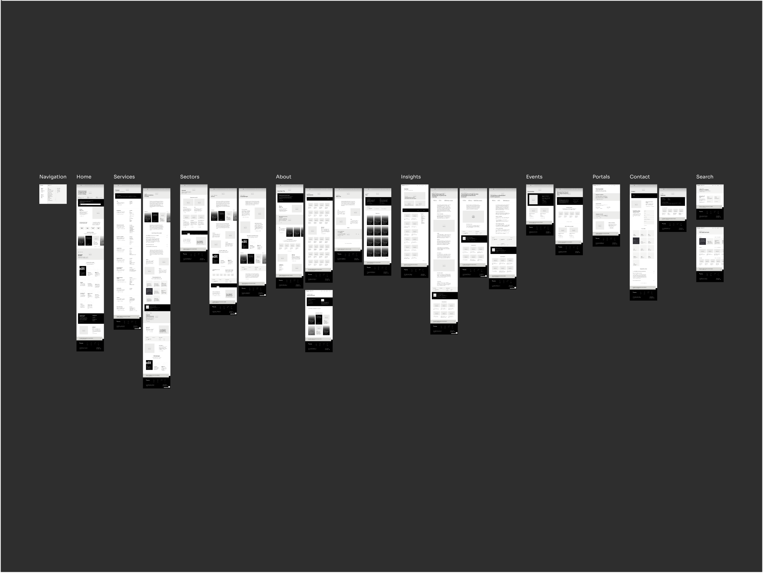
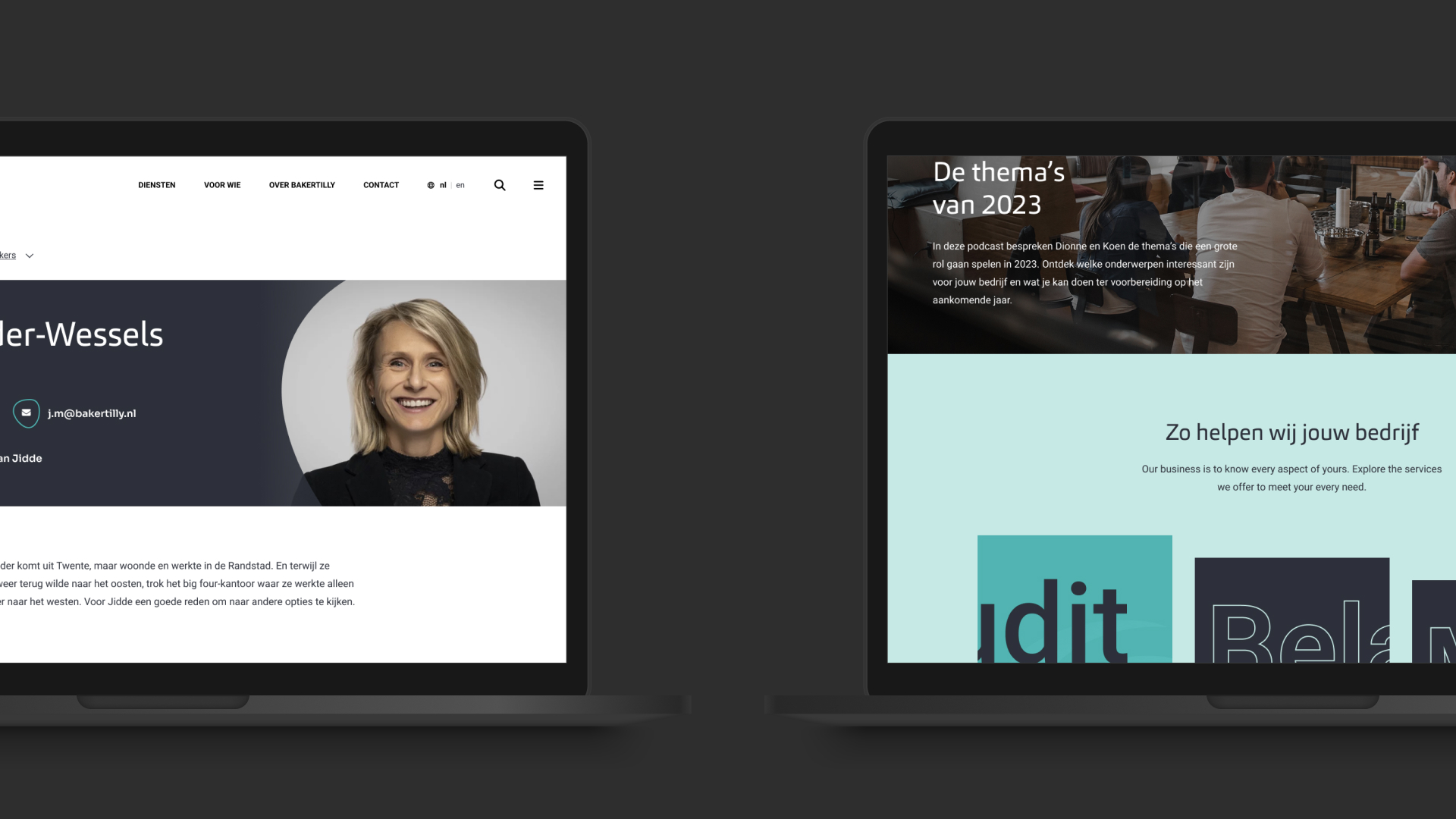
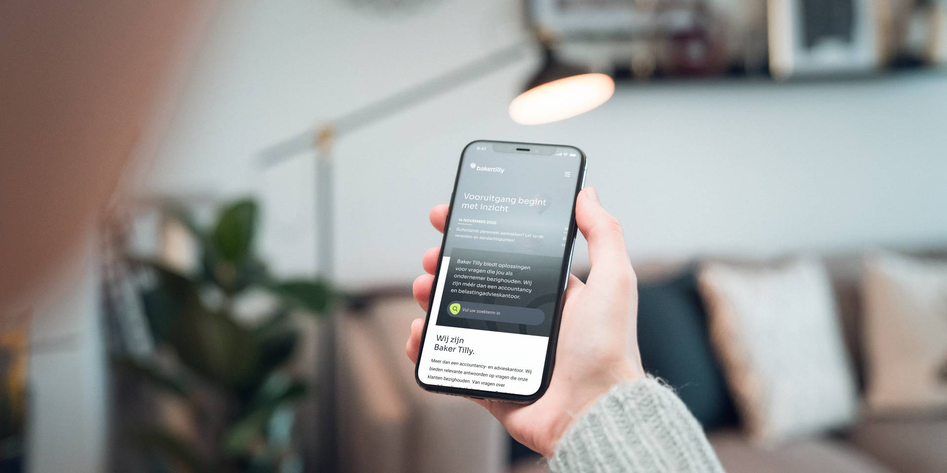
A redesign that honored where they'd been, hinted at where they were going, and prepared for the inevitable. The result: a modular page system spanning 1,000+ pages, a 20% lift in Dutch traffic, a 100% spike in English visitors, and a platform that let them grow without losing control.

Client Baker Tilly
Part of a global network of independent audit, tax, and advisory firms. Baker Tilly Netherlands operates locally with international reach, serving mid-market companies who need expertise that understands their world. Their competitive edge: deep industry knowledge, often shared through insights and thought leadership.
All about Baker TillyAgency ROX | digital agency
ROX is a digital agency located in Rotterdam that specializes in helping companies with their digital growth. Through a combination of strategic advice, polished designs and custom software development, they create web applications that are future-proof, scalable and improve work efficiency.
All about ROX | digital agencyRole UI/UX Design, Research, Strategy Support
I joined from the first client meeting and stayed through launch — shaping research (customer journey mapping, industry interviews), translating strategy into structure, and designing the full visual system and component library. The team was lean: my boss (CEO/Strategist) led discovery and strategy alongside me, while I owned all design decisions and worked closely with developers on implementation.
Delivery 2023, Updated 2025
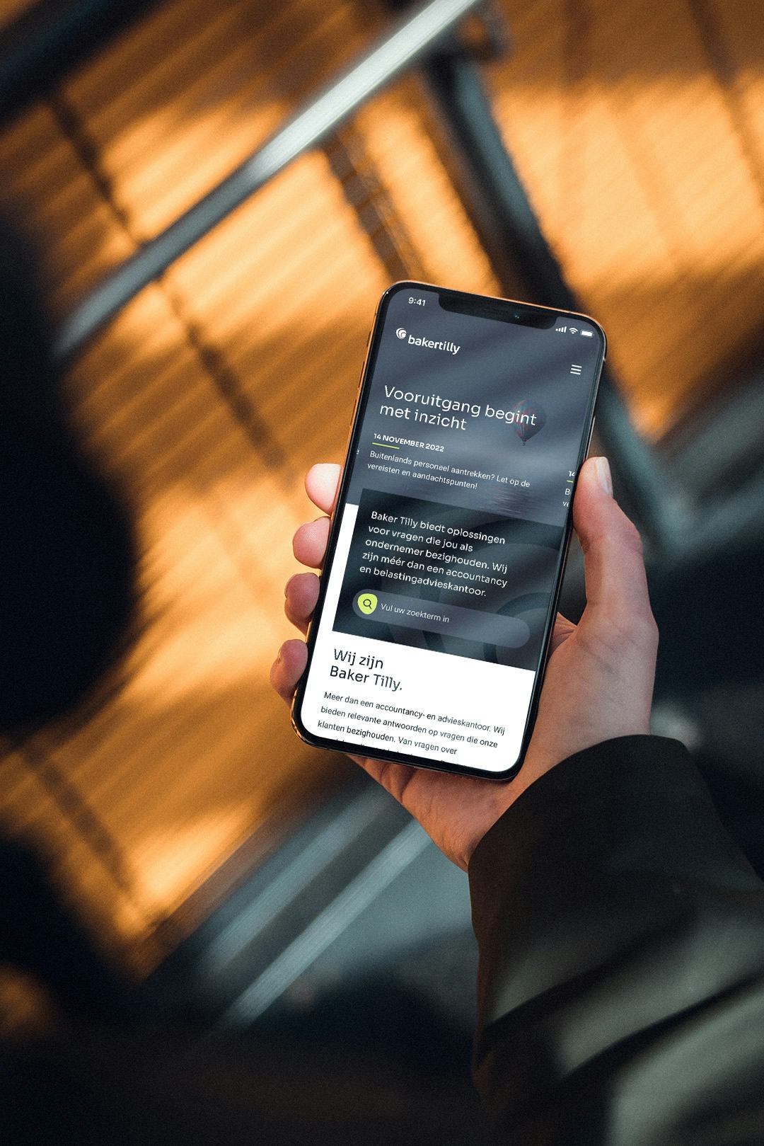
A full year from kickoff to launch, building a system designed to evolve. When the global rebrand finally arrived in 2025, the foresight paid off: we swapped out the old-style blocks and implemented the new identity in just two days. No rebuild. No drama. Just a seamless transition that proved the strategy worked.
Chamber of Constraints
Where precision meets pragmatism, and both win.

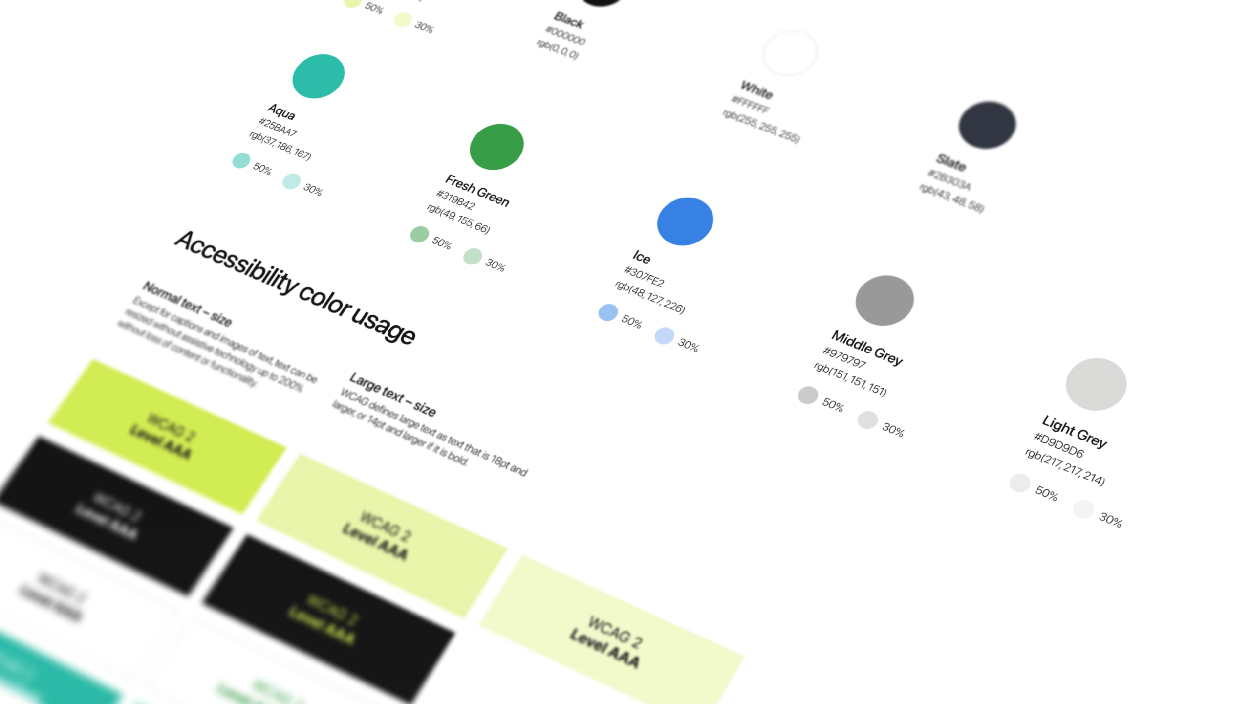
Accessibility Chamber
Even when it's not required, we make it right.
We didn't conduct an official WCAG 2.1 AA audit, that wasn't in scope. But we built as if we had.
Color contrast met standards. Keyboard navigation worked where it mattered. States never relied on color alone. We tested with screen readers and had colorblind team members at Baker Tilly review the work throughout.
No checklist. No compliance badge. Just a refusal to cut corners when people are counting on clarity.
(Noticed something making it harder to read? That reflection wasn't a disability, but we all benefit from more accessibility like increased contrast.)
Operations Hub
Where strategy becomes structure.
A great design isn't just well-executed — it's well-defended. Design criteria translate broad requirements into clear, measurable principles that guide every decision and give everyone a shared language to evaluate the work.
Without them, feedback is chaos. With them, every choice has a reason.
Echo Room
The work speaks. Here's what it said.