Skip to content LabelNoir.me

Making the Netherlands more aware of hearing damage

Created for VeiligheidNL As part of ROX

Woman wearing headphones

When a phone-era test meets modern expectations.

VeiligheidNL helps the Netherlands stay safe, from workplace hazards to everyday risks. Their hearing tests exist to catch hearing damage early and guide people toward professional help.

But the tests were showing their age. Originally designed for phone use, they had migrated to the web without ever truly adapting to it. A long form before the test, instructions that were often skipped, and a rebrand in progress.

We redesigned three hearing tests into one unified system: reducing friction, commanding attention, and building on a brand guide that wasn't finished yet. A cleaner, clearer path from first click to knowing whether you need help.

Facts & Figures

Client VeiligheidNL

VeiligheidNL is a non-profit organization dedicated to reducing accidents and promoting safety across the Netherlands. For over 35 years, VeiligheidNL has been developing tools, campaigns, and resources on a wide range of topics, from child safety to hearing damage prevention. It translates research into practical solutions that help protect people in their everyday lives.

Discover VeiligheidNL
Agency ROX

ROX is a digital agency located in Rotterdam that specializes in helping companies with their digital growth. Through a combination of strategic advice, polished designs and custom software development, they create web applications that are future-proof, scalable and improve work efficiency.

Discover ROX
Role UI/UX Design, Research

I joined from the first meeting through to visual design, leading wireframes, conducting user testing sessions, and designing the full visual system across three test variants. The team was lean: my boss (CEO/Strategist) led discovery and strategy alongside me, while I owned all design decisions.

Delivery 2025

From concept to launch across three hearing tests: hoortest.nl, oorcheck.nl, and bedrijfsoorcheck.nl. The project navigated an unfinished rebrand, scientific constraints on the test itself, and a style exploration of ten visual directions before landing on the right one.

Identity Wing

Safety, quietly woven into everyday life.

VeiligheidNL doesn't wait for accidents to happen. For over 35 years, they've worked to prevent them – developing research-backed tools, campaigns, and resources that protect people across every stage of life. From child safety to fall prevention, from workplace hazards to hearing damage, their work spans the full breadth of daily risk.

Their mission is straightforward but profound: make the Netherlands safer, one preventive measure at a time. They translate complex safety research into accessible, practical tools that reach everyday people, not just specialists.

The hearing tests sit at the heart of that mission. Not a clinical diagnosis, but a first signal. A nudge toward awareness, and when needed, advice to seek professional help.

Chamber of Constraints

Where the science set the limits and design filled the rest.

  • A/B Testing
  • API Driven
  • Accessible Design
  • Agile
  • Branding
  • Component Library
  • Design System
  • Editorial design
  • External collaboration
  • Flexible Page Builder
  • GDPR
  • Generative Content
  • ISO 27001
  • Information Architecture
  • Interactive Prototype
  • Journey mapping
  • Laravel
  • Location based content
  • MVP
  • Motion design
  • Multilingual
  • Next.js
  • Ongoing optimizations
  • Phased launch
  • React
  • Rich motion language
  • Scrum
  • Stakeholder Interviews
  • Statamic
  • Sustainable design
  • Technical SEO
  • Typography
  • Usability Testing
  • User Interviews
  • WCAG 2.1 - Level A
  • WCAG 2.1 - Level AA
  • WCAG 2.2 - Level AA
  • WCAG 3
  • Waterfall
  • Wireframes

VeiligheidNL

Our hearing test has been around for years and we'd like to modernize it. We have several variations, so we need a system that we can use for several tests.

Glad to help. Seeing as we aren't allowed to change the actual test, let's focus on improving the flow and improving the UI.
Manager

The deadline for this project is really tight, so I've made a packed timeline to make sure we get it done.

That timeline is way too optimistic. A waterfall approach won't work for this as every bump in the road will lead to delays. We'll need a more agile way of working.

Developer

The API driven approach nudges us to use React, which makes animations easier for us. Go wild!

Very nice, let's make this feel more like an app and less like a website.

VeiligheidNL

Our branding agency is creating a new visual style, however we're facing some hiccups and delays. This won't be finished in time before the new tests need to go live.

Let's go through what has already been created, see what parts are still in discussion and make a derivative of that.

Operations Hub

Standards built through discovery.

Three tests, one unified system, and a brand guide still finding its footing. As we worked through the discovery phase, the criteria emerged naturally, setting a clear standard for what good design meant in this context.

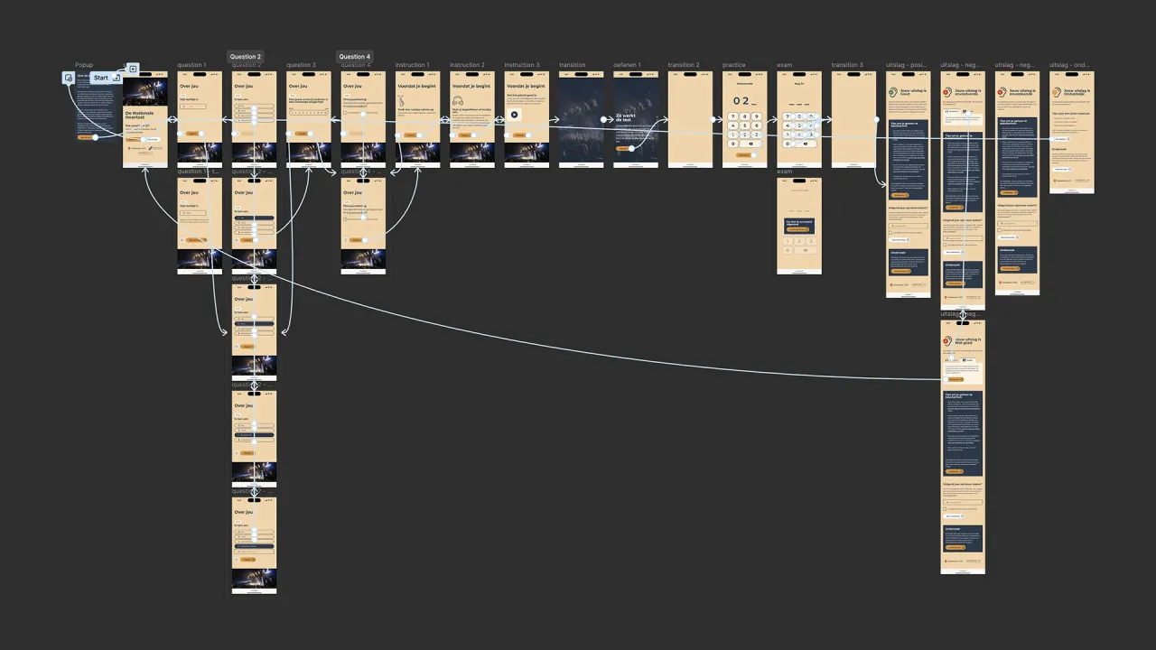
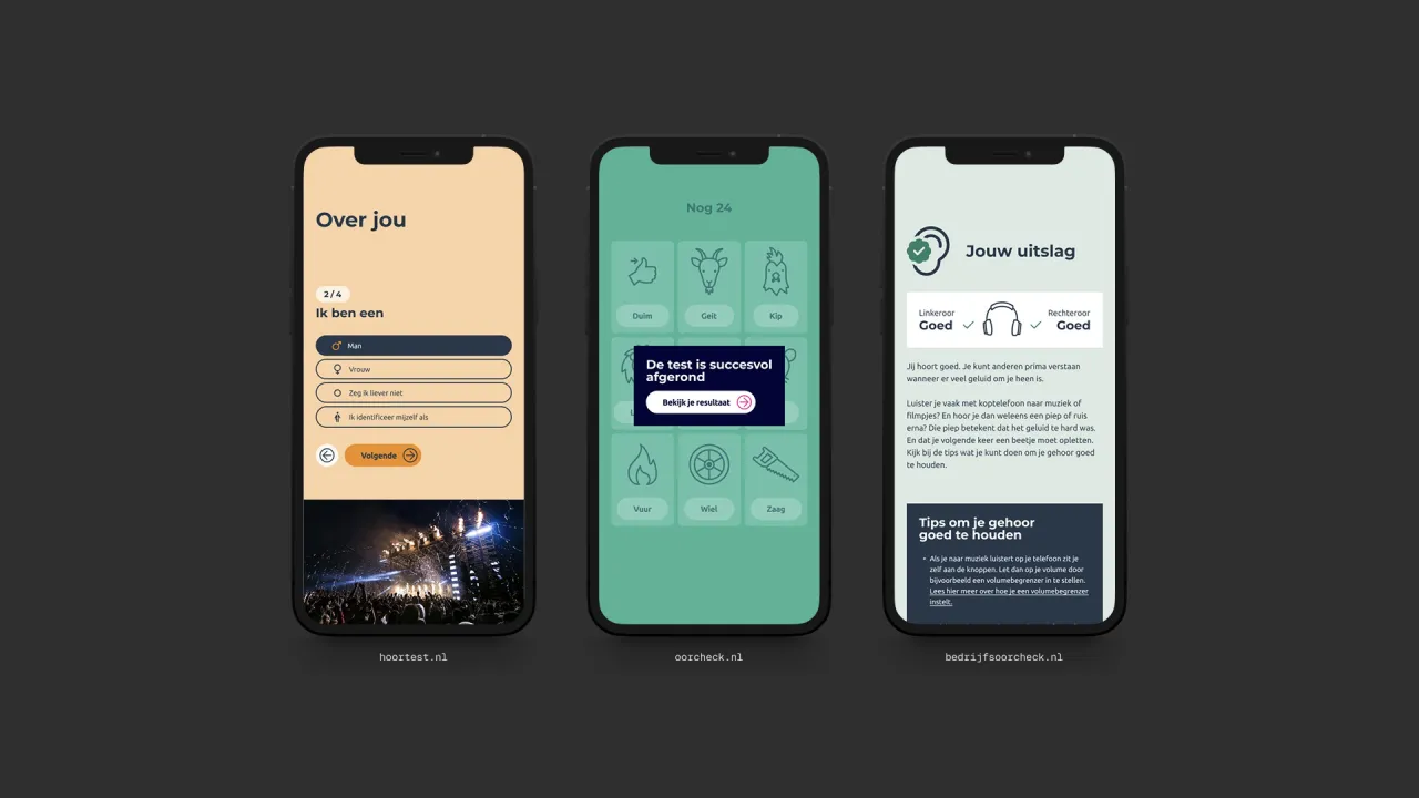
Mobile designs
Practice round of the test
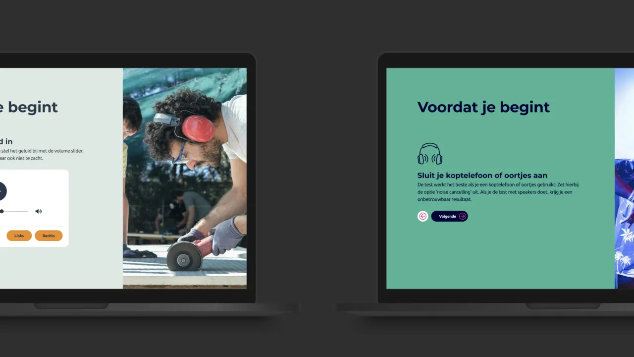
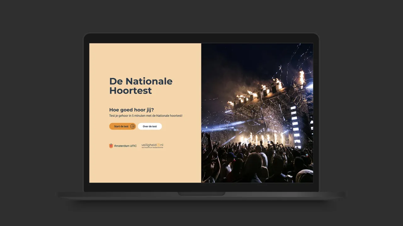
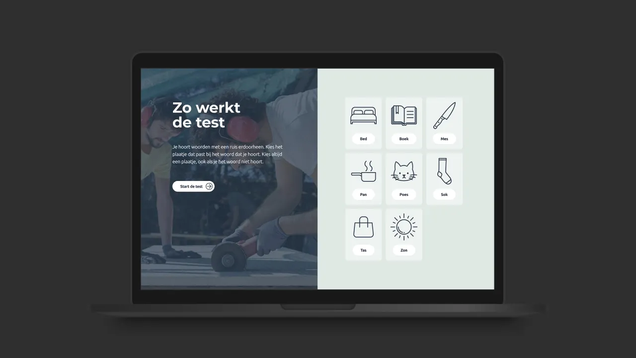
Two desktop designs
Prototype

Reduce Friction

A hearing test only works if people complete it. The original flow confronted users with a multi-field form before they could even start, making some reconsider taking the test in the first place. We replaced it with a multistep wizard, breaking the process into digestible steps. Less overwhelming, lowering the barrier to entry and driving towards more completed tests.

Command Attention

Instructions matter for accurate results. Headphones required, quiet environment, no distractions. But a wall of text often gets skipped. We transformed the instruction flow into a carousel: one clear message at a time, accompanied by custom icons, impossible to gloss over. Consistency with the wizard form was a bonus.

Unified but Distinct

Three tests for three audiences – general public, youth, and professionals. One design system. We built a unified visual framework with variants for each test, ensuring consistency across the suite while respecting the differences between audiences and test mechanics.

Design Around Constraints

The scientific test couldn't be changed. Early on we identified UX improvements, like adding a submit button to allow corrections before auto-submission, but these were rejected as they affected the underlying algorithm. So we designed around the edges: improving everything we could touch, respecting everything we couldn't.

Accessible by Intent

The tool was designed with accessibility in mind: keyboard navigation, sufficient contrast, clear visual hierarchy. One deliberate exception: text alternatives for audio. Adding subtitles to an audio hearing test defeats its purpose. Accessibility was applied everywhere it made sense, and consciously set aside where it didn't.